AP Macroeconomics
The Production Possibilities Curve (PPC)
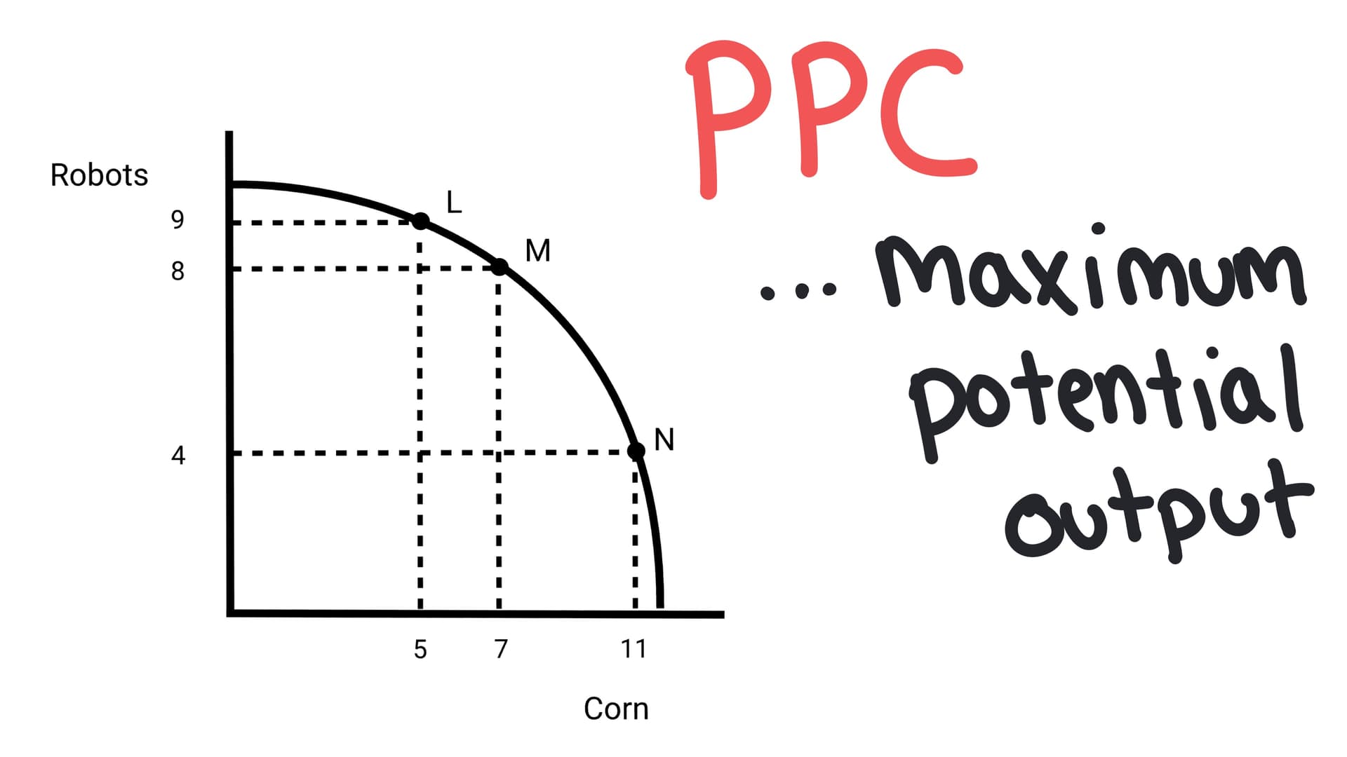
The Production Possibilities Curve (PPC) is a graphical model that shows the maximum combinations of two goods an economy can produce when all resources are fully employed. It illustrates the core economic concepts of scarcity, trade-offs, and opportunity cost.
The “Model of Choice”
Imagine you are the ruler of a small country. You have a fixed number of workers, factories, and land. You can’t snap your fingers and have infinite skyscrapers and infinite pizza—you have to choose.
That’s what the Production Possibilities Curve (also called the frontier) illustrates: the maximum possible output of two goods an economy can achieve when resources are fully employed.
In this example, our economy produces just two things: Robots and Corn.
- Point A: We go all-in on technology. 10 Robots, 0 Corn.
- Point E: We go all-in on agriculture. 12 units of Corn, 0 Robots.
- The Curve: The line connecting them represents every possible combination in between.
The 3 Zones of the PPC
Where your country sits on (or off) this graph tells you everything about the health of your economy.
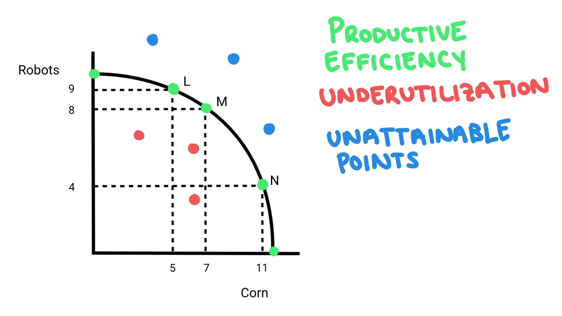
1. On the Curve: Productive Efficiency
Any point that sits directly on the solid line represents Productive Efficiency.
- What it means: You are squeezing every ounce of productivity out of your resources. There is no waste.
- The Catch: To get more of one thing, you must give up something else. You can't get more corn without giving up some robots.
2. Inside the Curve: Inefficiency (Recession)
Any point inside the shaded area represents Underutilization.
- What it means: You have idle factories. You have workers sitting at home.
- The Reality: In Macroeconomics, this gap between where you are and the curve is often a recession. You could produce more if more people were working, but instead there is unemployment and a gap between what you could produce and what your actual output.
3. Outside the Curve: Unattainable
Any point beyond the line is currently impossible.
- What it means: You simply don't have the technology or resources to reach this level of production yet.
- The Goal: The only way to get here is through economic growth, shifting the entire curve outward. (More on this below!)
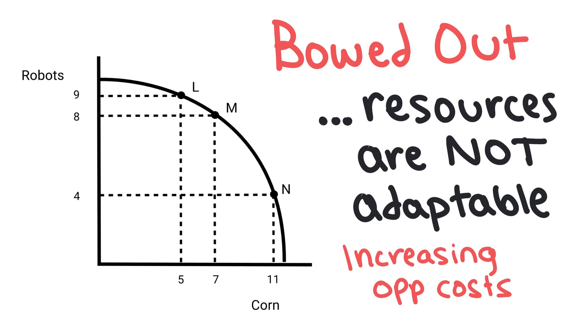
Why is the Line Curved? Opportunity Cost.
You will notice the graph isn't usually a straight line—it's bowed out (concave). This shape tells a story about your workers.
The Law of Increasing Opportunity Cost states that as you produce more of one good, the opportunity cost (what you give up) gets higher and higher.
- Phase 1: To grow the first few tons of corn, you move farmers who were bad at building robots anyway. You don't lose many robots.
- Phase 2: To grow even more corn, you have to start forcing your best robot engineers to drive tractors. They are bad at farming, and you lose a lot of robot production.
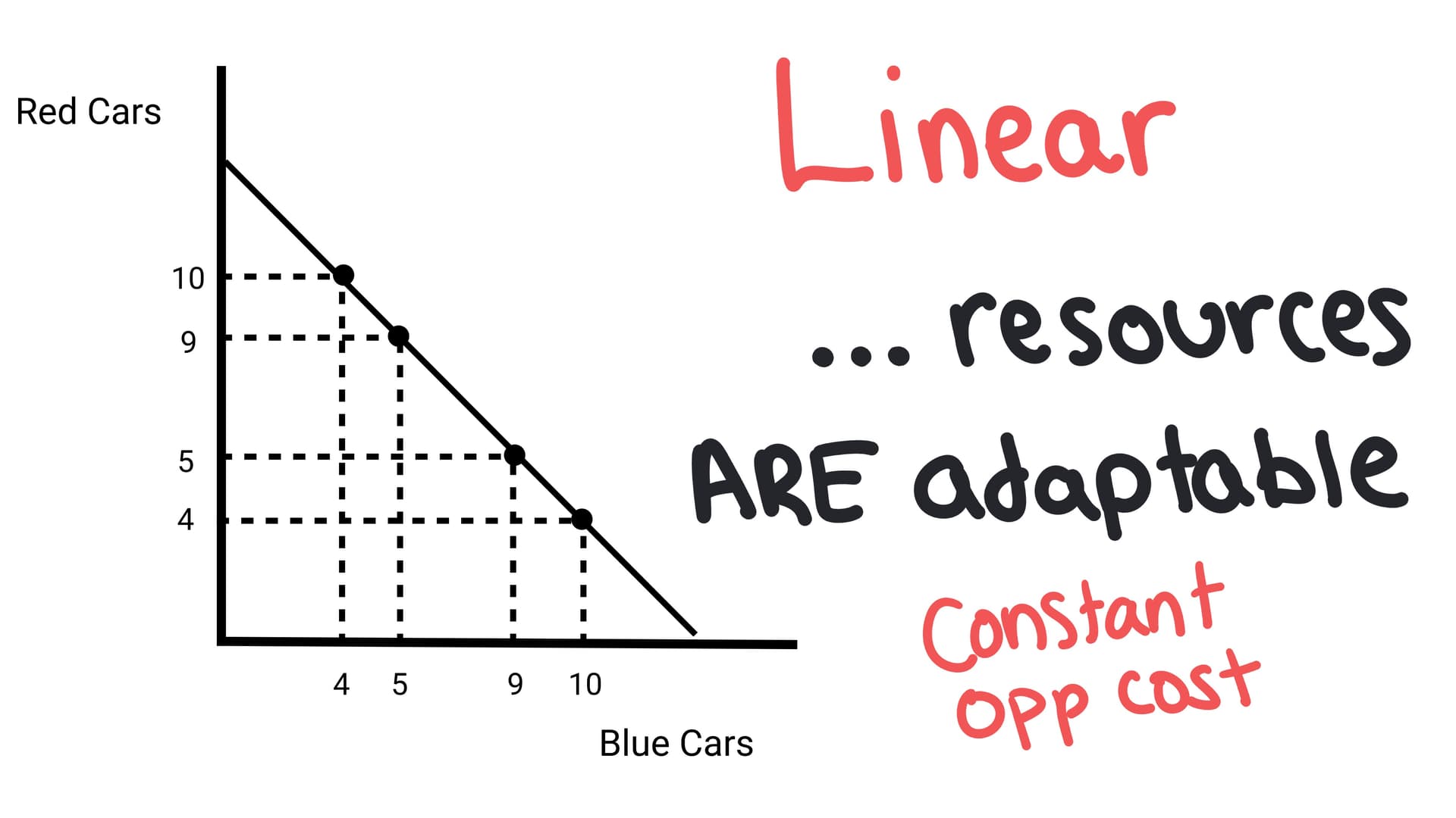
What if the line IS straight?
If the PPC is a straight line, it means resources are perfectly adaptable. This is like choosing between red cars vs. blue cars. The resources you need to make one car are nearly identical to the resources needed to make the other. Your red car experts are also blue car experts. You can switch back and force without a loss of efficiency, so opportunity costs remain constant.
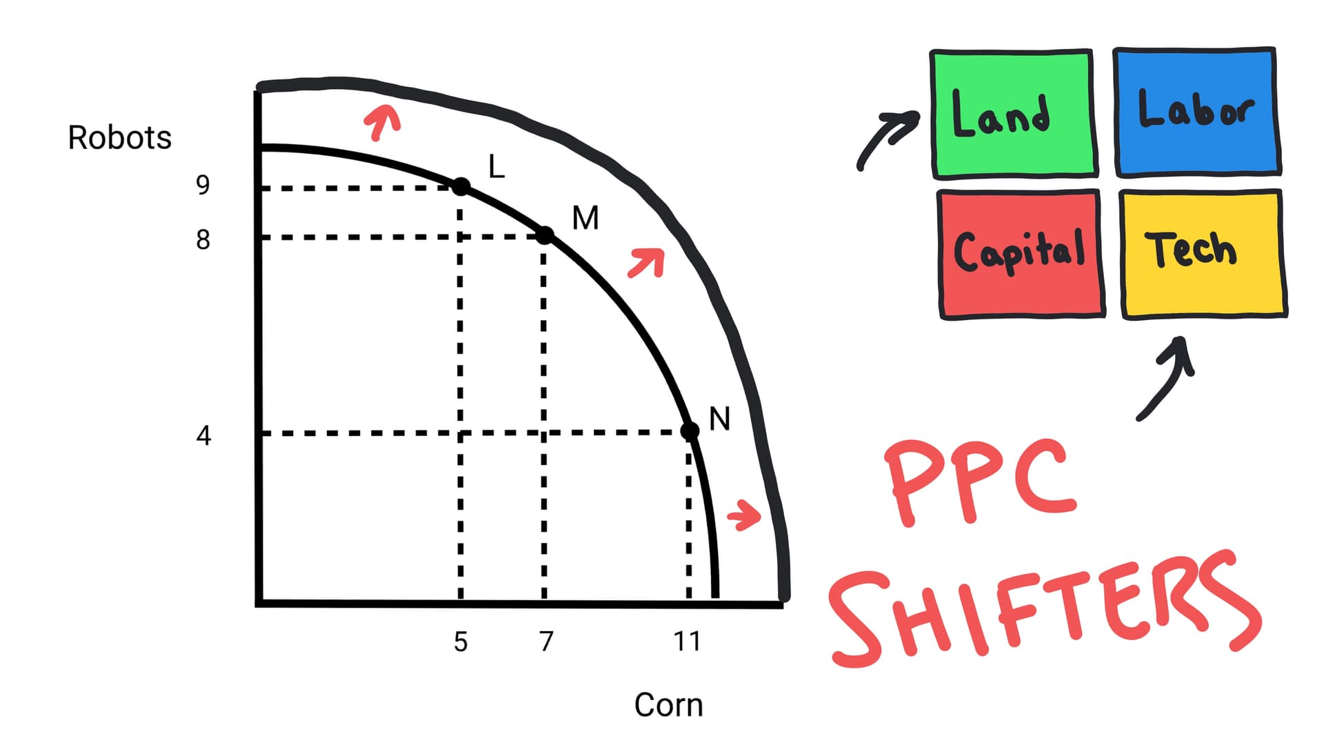
Shifting the Curve
The curve is a prison, but you can break out of it. The PPC can shift Outward (Growth) or Inward (Shrinkage), but only if the capacity of the economy changes.
The 3 Main Shifters:
- Change in Resource Quantity: A wave of immigration increases the labor force, or new oil reserves are found. (Shift Right).
- Change in Technology: The internet is invented, making everyone faster. (Shift Right).
- Change in Trade: Trade allows you to consume at a point outside your curve, even if you can't produce there.
Stop Reading. Start Drawing.
Try the Graph Gym challenge right here.
Graph Gym Challenge
Draw a PPC for two goods. Show how an increase in the quality of resources shifts the curve outward to represent economic growth.
Join the Dojo to Access Graph Gym
Unlock unlimited Graph Gym challenges, Dojo Drills, and more with a Season Pass.
Learn MoreInstructions
Draw a PPC for two goods. Show how an improvement in technology shifts the curve to represent economic growth.
To Do:
- Show the original PPC
- Show the new PPC after growth
- Label both axes with specific goods
- Indicate that both maximum outputs increase
Want to try more Unit 1 MCQs?
Check out the MCQ Practice Page.
Check Your Understanding
Question 1 of 2
A point located inside the Production Possibilities Curve (PPC) indicates that: